


Gentle Rememberance
- Jules

- Feb 6
- 2 min read

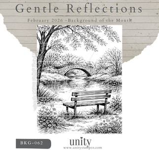
There’s a softness to this scene that immediately slows you down. The arched bridge, still water, bare trees, and—most poignantly—the empty bench. It’s a place that feels familiar, like somewhere you’ve sat before with someone you love, or somewhere you might return alone, carrying memories with you.
The sentiment, “What is remembered, lives.” from the Navigating Grief stamp set is simple but powerful. It doesn’t try to fix the grief. It honors it.

Symbolism in the Design
The Empty Bench: The bench represents absence—but not emptiness. It’s a quiet symbol of someone who once sat beside us and now lives on in memory. Leaving it unoccupied invites the recipient to place their own meaning, their own person, into the scene.
Uncolored, Vintage Postage Look: By keeping the image largely uncolored and working in soft, muted browns, the card takes on an old-world, almost postal feel—like a memory pulled from another time. This vintage approach reinforces the idea of reflection, remembrance, and moments that never truly fade.
Distress & Soft Texture: Distress inks and spray stains were used gently, allowing the background to feel weathered rather than heavy. Much like grief itself, the layers are subtle, imperfect, and deeply human.

How This Card Came Together
Stamping the Scene: The Gentle Reflections background was stamped onto ivory cardstock using VersaFine Clair - Fallen Leaves ink to keep the linework soft and timeless.
Creating the Aged Look: Distress Inks in warm neutrals were lightly blended around the edges, keeping the center lighter—almost like a memory coming into focus.
Adding Depth & Texture: A light spritz of Distress Spray Stain in white and walnut added organic speckling and visual interest without overpowering the scene.
Framing the Moment: The panel was die cut with the Postage Stamp Nesting Dies to enhance the vintage feel, then layered onto a dark, textured background for contrast.
Finishing Touches: The sentiment from Navigating Grief was stamped directly onto the scene so it feels like part of the landscape, not an afterthought. A small button embellishment adds a quiet, tactile detail—simple and intentional.
Why Cards Like This Matter
When someone is grieving, bright colors and cheerful phrases can feel out of place. This card offers something different: acknowledgment. It says, I see your loss. I honor your memories. You’re not alone.
Sometimes the most meaningful cards are the ones that whisper instead of shout.


Products Used
Stamps
Inks & Mediums
Ranger Distress Stain Spritz – Walnut Stain
Dies & Embellishments
Misc. Button embellishment
Thank you for stopping by and I hope you found some inspiration and some solace today.
Until next time... Happy Crafting!


Comments